Familiarise yourself with the principles that make us Sky Bet.
Brand Positioning
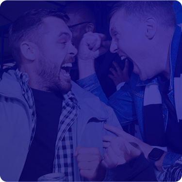
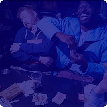
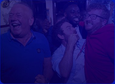
We are “For the Fans”
“For the Fans” is our mission to champion modern fandom.
We celebrate the side of the game that belongs to the fans: the local
pride, humour, rivalry, heartbreak, the irrational passion of it all. The
stories you’ll tell for years afterwards. Because sport isn’t
just something they watch, it’s part of who they are.
That’s Fandom.
From League Two to the Premier League, Cheltenham to The Oval; we
celebrate the moments, emotions and communities that make sport unlike
anything else. The game gives us the moments. Fans give them meaning.
Brand Behaviours
We are “For the Fans”
Our role
We bring fans closer.
What it means
We bring fans closer to the moments that matter. Whether through our products, partnerships, content or experiences, we help fans feel part of the action – not just watching it.
Why it wins
Sport is at its best when fans feel part of the action. By creating products, content and experiences that bring fans closer to the game, we make every moment more engaging, more memorable and more meaningful.
Our role
We celebrate what fans love.
What it means
We celebrate everything that makes being a fan unlike anything else. The rivalries. The rituals. The banter. The belonging. The things only fans understand.
Why it wins
In a category built around individual transactions, Sky Bet champions fandom. The best part of sport has never just been the sport. It’s everything around it. By celebrating fan culture – not just the action on the pitch – we create work that feels more relevant, more entertaining and more emotionally connected.
Our role
We give fans more.
What it means
Fans give everything. So do we. Whether it’s through our products, rewards, experiences or service, we always look for ways to give fans more than they expect.
Why it wins
Loyalty in sports runs deep, but in betting it has to be earned. We create products, experiences and rewards that prove we genuinely understand what fans care about. By adding value beyond the bet, we build trust, reward loyalty and create reasons for fans to keep coming back.
Tone of Voice
How We Speak to the Fans
These three words should guide our key messaging, copywriting and manners
across all touch-points.
Entertaining
Entertaining
Sport should be enjoyable. So should we. We make fans smile. We make them laugh. We spark debate. We tell stories worth sharing. Whether it’s a TV ad, social content or a CRM message, we make fandom more entertaining – not just transactional.
Acid test: Would a fan send this to a mate?
Passionate
Passionate
We care as much as fans do. We celebrate. We debate. We feel the tension. We never sound detached. We don’t report football. We live it.
Acid test: Does this capture what fans are feeling?
Human
Human
Sport is built on real people, real opinions and real emotion. So are we. Natural. Conversational. Observational. Never scripted. Never corporate. Always human.
Acid test: Does this sound like a real fan?
Creative Principles
How the Brand Should Look to the Fans
There are filters that can be used to evaluate ideas, campaigns, content,
sponsorships and experiences.
Magnetic
Magnetic
The work demands attention. It stops people scrolling, gets them talking and pulls fans into the moment. Fans are bombarded with content. If we don’t capture attention immediately, nothing else matters.
Acid test: Would this stop someone scrolling?
Epic
Epic
Treat every moment like it matters. Every moment matters. We capture the emotion, anticipation and significance that fans already feel. We don’t just describe moments. We elevate them.
Acid test: Have we elevated the moment, or simply described it?
Generous
Generous
Always leave fans with more. More entertainment. More value. More access. More reasons to come back. Because generosity isn’t something we do occasionally. It should define every interaction.
Acid test: What are fans getting from this beyond a marketing message?
Visual Identity
Learn how to create consistent and iconic Sky Bet communications.
Logo
Colour
These are our primary logos.
Sky_Bet_ON_DARK
Sky_Bet_ON_LIGHT
Logo
Clearspace
Use the height of the ‘S’ in the logo to identify the
clearspace.
Do’s
Our logo embodies confidence and premium nature. Featuring the Sky
Bet logo in our communications reinforces the trust our customers
place in us.
As our most valuable asset, it deserves the utmost care and respect.
Here are some ways we can ensure that confidence and premium quality
is consistent.
The logo must always be in a prominent position and clearly legible.
The logo can be used to qualify a campaign or product lock-up, before or after it.
For brand communications, the logo can be placed where it makes sense according to your message.
The logo can be justified to suit the appropriate flow of copy.
Don’ts
Inconsistent or improper use of our logo can weaken our brand
identity. Avoid misusing, distorting, or disregarding usage
principles, ensuring every execution remains considered and
recognisably Sky Bet. Always observe the clearspace and minimum size
guidance.
Do not add any effects to the logo.
Do not change the scale of any parts of the logo.
Do not skew the logo.
Do not change the colour of the Bet box.
Colour
Core Colours
Maintaining brand equity with a strong foundation of core colors.
Primary Blue
HEX
RGB
CMYK
Only use this Secondary Blue when print requirements or production
considerations make it the more appropriate choice.
Secondary Blue
HEX
RGB
CMYK
PMS
Sky Bet Red
HEX
RGB
CMYK
PMS
Sky Bet Yellow
HEX
RGB
CMYK
PMS
White
HEX
RGB
CMYK
Colour
Brand Gradient
Inspired by our brand blue, introducing our brand gradient.
Core brand asset
A distinctive visual asset that plays a key role in expressing our
brand. Inspired by our primary brand blue, it adds depth, energy and
recognition across all communications, helping create an
unmistakable presence.
Flexible application
It can be cropped, scaled and repositioned to suit different creative
layouts while maintaining its visual impact. Use it as a foundational
background element to bring cohesion and personality to designs.
Production & motion
High-resolution versions are available in both RGB and CMYK, ensuring
optimal reproduction across digital/print applications. The gradient
should also be used as the brand end frame within AV content.
Colour
Typography Pairings
When combining colour with typography, it is important to maintain
legibility. Follow these pairings to ensure maximum distinction.
Typography
Primary Headline Font
Sky Sports Bold is our Primary Headline font.
Large Headlines / Huge Type Treatment — Sky Sports, Bold
All bets on football are automatically settled on the basis of 90
minutes play unless otherwise stated for that particular market. 90
minutes play includes time added on by referee for stoppages. The only
exceptions are for matches that are played for a lesser duration (e.g.
60, 70 or 80) as agreed by the laws of the competition in which they
are competing or agreed by both sides prior to kick-off.
Always follow the typography guidance outlined in this document. For
up-to-date templates, please reach out to Flutter Creative.
Only use our two Sky Sports fonts within the Action Box. Use Sky
Sports Bold for larger headings, and Sky Sports Light for smaller
headings.
Some offers have key words highlighted in red. Only mirror this from
approved Sky Bet templates.
Only use Acumin Variable Concept Condensed for Terms and Conditions.
Action Box
Action Box
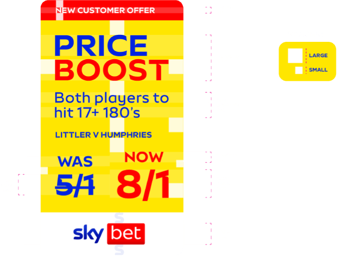
The Action Box must always be crafted to ensure correct hierarchy and
prioritise negative space; this ensures bold, clear and impactful
messaging.
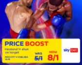
This is our Action Box – always yellow, always functional –
always for our offers. All actionable content lives in here.
This will help maintain consistency and enhance legibility across all
formats.
These two spacers should be used to measure accurate spacing between
portions of the Action Box.
They should not be re-sized independently, and should always match
the size of how they appear within the template.
Huge Type
Huge Type Treatment
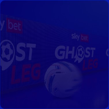
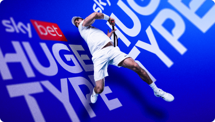
Huge Type is a Sky Bet visual device used to inject scale, energy and
brand presence into imagery. Rather than sitting on top of the image as
a graphic overlay, the typography should feel embedded within the
environment itself, occupying the same physical space as the subject,
surface or arena. The treatment creates the impression that the words
exist in the world of the image, transforming backgrounds into branded
environments.
The typography should follow the perspective, depth and angle of the
scene. Letters can extend beyond the frame, sit behind subjects, and
interact with environmental effects such as motion blur, debris and
shadows.
This treatment may be used for any creative which requires a unique
aesthetic outside of our BAU Motion Energy treatment, such as Sky Bet
products or elevated offers.
Motion Energy
Core Principle
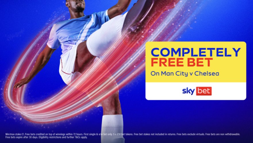
This is our new default treatment for BAU imagery.
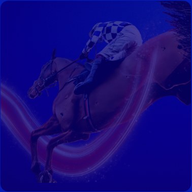
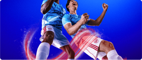
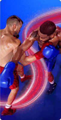
Motion Energy visualises the force behind the moment, translating
movement into a tangible visual layer that enhances the image.
It introduces flow, intensity and direction, but always in service of the
subject. The treatment should feel like a natural extension of the action
already taking place.
At its best, Motion Energy amplifies what is already present in the
image, making moments feel more dynamic, more immediate and more
impactful without ever distracting from the core narrative.
Imagery
Our Creative Principles
Magnetic
The work demands attention. It stops people scrolling, gets them talking
and pulls fans into the moment. Fans are bombarded with content. If we
don’t capture attention immediately, nothing else matters.
Epic
We make sport feel as big as fans know it is. Every match matters to
someone. Every rivalry has history. Every moment has emotion. We elevate
those moments rather than simply reporting them. Fans don’t
remember statistics. They remember feelings. Our work should capture the
scale, anticipation and emotion that makes sport unforgettable.
Grid System
Overview
Inspired by the shape of the Bet Box, we have a grid system that allows
us to present as a unified and consistent brand across any touchpoint.
We achieve this by first defining our grid and the container corners.
1. Grid
2. Container Corners
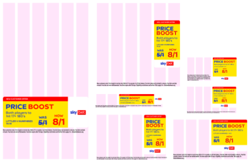
6 column layouts
Layout Reference - A 6 column layout for smaller digital placements
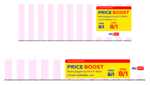
12 column layouts
Layout Reference - A 12 column layout for larger formats
Downloads
Get your hands on everything from logos to PowerPoint templates.